The shade of green on the puffy jacket is familiar and somehow cozy. A little bluish, lighter and softer than hunter, but still more green than teal. A green that makes you feel like it’s 1987 and you’re a kid again, wearing your mom’s hand-me-down long underwear and sleeping in a slightly smelly canvas tent. The puffy jacket’s beige lining, patch hand pockets with flaps and snap placket clinch the effect. When Amanda Russell lifts it up for closer examination, you can almost smell the dew of a bright, chilly alpine morning.
That’s exactly the sort of vibe Russell, senior manager for color and print at REI Co-op, was hoping to foster when she and her team selected this particular green as the flagship in a new timeless palette—REI Archive Colors— that they’ve developed for REI Co-op products. Poring over several decades of green co-op apparel and gear pulled from the Co-op Living Archive, Russell and creative directors Nicole Rock and Ian Eburah kept coming back to this 1978 REI Alpine Jacket.
It was just “so special,” Russell says. “This color in this jacket—you could look through your family history and find a picture of someone that has something similar. There’s this emotional connection to color that I think is so exciting, and sometimes it happens at a subconscious level that people don’t quite understand.”
The green was also completely its own. It did not appear in existing engineered color standards that the designers relied on, so dye would need to be specially formulated to match it. In other words, the magic green could be a signature hue for REI. It was a perfect choice for the core REI Archive Color palette, which designers developed to reflect the brand’s heritage and identity, so that they can carry that authenticity into contemporary designs and prints long into the future.

The Living Archive: A Source of Inspiration
Situated at the center of the co-op’s Creative Hub space in Seattle, the Living Archive is the project’s foundation and inspiration. Its 20 rolling stack shelves, 20 or so flat files, and various racks and boxes house everything from 150-year old tintypes of REI co-founder Lloyd Anderson’s ancestors, to a parka hand-sewn in the 1960s by disability justice activist Delia Cano when she worked at the co-op, to former REI CEO Sally Jewell’s ice axe. Most importantly for the color team’s purposes, the archive contains every catalog published since the co-op’s creation in 1938, as well as a curated selection of apparel, sleeping bags, tents, backpacks and other gear.
Typically, picking a color palette starts by surveying trends, Russell explains, with designers dipping into what’s happening in clothes, interiors, even contemporary fine art, and assembling visual boards of images and color swatches to help guide the process. For this color palette inspired by the archives, the team surveyed every color-printed REI catalog since 1967, looking for sparks of joy and connection. From that work, the team narrowed down four color themes that seemed consistent and classic in outdoor gear across the years: red, blue, yellow and—of course—green. “You go to a campsite, and you’re going to find all four of those colors being worn around that campsite—mixed in different ways, with different personalities, but they’re there,” Russell says.

But the work wasn’t done yet. There are dozens of shades of yellow, for example. So, the group then needed to pull down hundreds of color swatches and begin a process of elimination and elevation, culling these yellows because they were too pastel, say, and these others because they had too much red undertone. The team considered feasibility—whether specific hues would reproduce in certain fabric or work with a certain product—as well as whether designers could successfully use them in prints and with other palette colors selected for the season.
“It seems like they just kept going through this breathing motion,” observes co-op historian Will Dunn, who oversees the archive. “They started with, the idea of green, which is so broad, and then, you kind of exhale down to something more specific, and then realize, ‘Oh, that’s not quite right. It actually did need more yellow.’ And so, it breathes back out into that spectrum. And it just kind of went through that motion many, many times.”
From Heritage Hues to Signature Shades
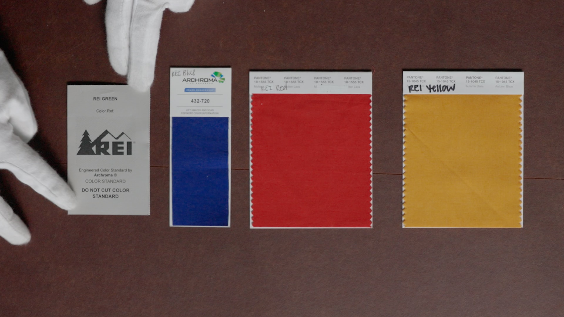
As Russell and her team color “breathed” over the course of about three months, they worked with Dunn to pull selections of gear that they could see and touch and talk about. Some of these naturally spoke to the group, just as the green jacket did. Eburah was particularly taken with a cotton anorak of deep blue with red undertones, and this arresting shade helped inspire REI blue. Historical tents and the accent trim on a giant down Cyclops Bivy sleeping bag from 1962 that incorporated all three primary colors helped inspire REI yellow, a shade that recalls a fisherman’s slicker. REI red has roots in the sleeping bag’s body color, and is as rich and orange-y and bright as tomato soup on a cold day.
Russell relishes discussing the finer points of the co-op’s new palette. She got her start working with color more than 10 years ago as a designer at Michael Kors in New York, making women’s clothes. When she found herself escaping the city every weekend to hike and trail run and camp, she realized she needed a change, and took a job working on color design for Patagonia. About eight years ago, she made the leap to REI in Seattle and worked her way to the top of the color team.

Bringing the Palette to Life
Russell pulls a women’s snow jacket off a rack and holds it up to show off its wild horizontal waves of black stripes atop an on-trend fuchsia, both set off with hot streaks of REI red that add a classic feel to the striking pattern. There’s also a kid’s fleece in solid red, its warmth enhanced by a contrasting slash of REI-blue zipper. Then, Russell stretches up to a high bin on a shelf and pulls down a sample of polar fleece with white, fuchsia and REI red splashed across an earthy terra cotta color in an appealing botanical pattern. Next is a swatch of soft magenta flannel plaid with REI red and a deep brown spice color zinging through.
These are just a few examples of how the co-op is featuring REI red in fall 2025’s products, Russell explains. It’s a foundational color for the new REI Co-op Campwell and Trailmade collections and women’s snow, and appears in multiple different fabrics and styles for men, women and kids, and in both prints and solids. These colors are about “honoring our own product and our own stories,” she says. But “we’re actually using these colors in a more modern way, and it’s also building season over season.” REI blue also debuted for fall in the Campwell and Trailmade collections, as an accent and component of fabric prints, because its unique undertones add “a really beautiful kind of unexpected pop,” Russell says.

REI yellow, meanwhile, will feature prominently next spring, as a solid color for tents and backpacks in the Trailmade collection, as well as in a fabric that improbably incorporates lime green, spice and blue into a print that looks lovely alongside the yellow gear. And that magnetic REI green will come in fall of 2026, because it must be custom dyed—no existing green was the right match. It will mostly feature as a solid color in apparel in the Campwell and Trailmade collections.
Dunn is thrilled by results of the color team’s effort. “History is collaboration,” he says. “Everyone has an opinion who REI is, but none of us are completely right on our own. It only starts to make sense when you add all of us together. The color palette follows a little bit of that thinking. Looking at the sum of our past to understand who we are. It’s cool to see that come through in a physical expression.”
But that color palette is not yet complete, its own history still being collaborated, still coming alive. And the co-op has Russell’s “shower thoughts” to thank.
“I would be home, and it would just be bothering me: I think we’re missing something,” she says. A possible fifth color was nagging her. Sometimes the answer came to her as often the best ideas do, in the shower. Russell can’t say what it is yet, but if you consider that the palette already includes the three primary colors and a green, “what would the obvious color be?” she asks. “You could probably guess it.”
Can you guess the fifth REI Archive Color?
Leave a comment with your ideas.
